When Email Attribution Is High, Something Else Is Usually Wrong
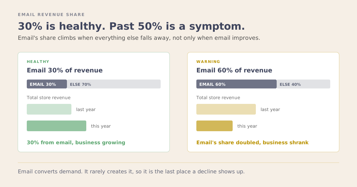
Email attribution is the number people quote when they want the retention work to sound like it is paying off. A healthy account usually sees email credited with somewhere around 30% of revenue. When that figure climbs past 50%, to 60% or 70%, it tends to get said with even more pride. That is the point where I start to look harder. The figure is an attributed share, a model deciding how much of each sale to hand to email, and it can climb for reasons that have nothing to do with how the email is doing.
I looked at an account like that once. The email share was high and still climbing, well past 50%. Total revenue was down 30% year on year.
Both were true, and the first was a symptom of the second.
A Ratio Has Two Sides
The attributed share goes up when email gets better. It also goes up when everything else gets worse.
Ad costs rise, so the budget buys fewer new visitors. Fewer people find the store on their own, through search and word of mouth. New customers arrive more slowly than they used to. Email keeps converting the people who are still there, so its slice of a smaller pie grows every month.
On a dashboard those two situations produce the same chart moving the same direction. Opposite diagnosis, opposite response, and only one of them is worth being pleased about.
So the share is a prompt, not a verdict. When it climbs past what is normal for the business, that is the moment to look at the absolute numbers, and hardly anyone looks at both at once.
Why Email Holds Up While Everything Else Falls
There is a structural reason this happens, and it is not a flaw in email.
Email converts demand. It does not create much of it. Almost everyone receiving your campaign already bought from you, or gave you an address because they were interested. That audience was assembled by money spent in the past on bringing in new customers, and it keeps responding for a good while after the spending that built it has stopped.
So when fewer new customers are coming in, email is the last thing to show it. The list still converts. The flows, the automated emails that go out on their own, still fire. Revenue per send holds up, sometimes improves, because the people left on the list are the most engaged ones.
Email is a lagging indicator wearing the costume of a leading one. By the time the email numbers turn, the problem is a year old.
What That Account Actually Had
The email program was fine. Emails were landing in inboxes, flows were live, campaigns went out on schedule.
What had happened was that new customer acquisition had fallen away, and nothing in the email reporting had any reason to mention it. Klaviyo reports on the list it has. It has nothing to say about the customers who never arrived to join it.
Email will always look good in its own report when it is built well, so the report was never going to raise the alarm. The signal was the share itself, climbing past anything the business could explain.
The tell, once we looked, was the mix. The proportion of revenue coming from people who had bought before kept rising. That reads as a retention win right up until you notice it is rising because the first-time buyers stopped coming, not because the repeat buyers increased.
Three Checks
Look at absolute email revenue, not the share. Is it growing in actual money, year on year, on comparable sends. A rising share with flat or falling absolute revenue means the total got smaller rather than email getting bigger. That is the whole story in one comparison and it takes 2 minutes.
Look at where new list members come from, and whether there are fewer of them. List growth is the closest thing email has to an acquisition signal. A list that is losing people faster than it adds them is a business that will feel it in about 2 quarters, and email will be the last place it shows up.
Look at the split between first-time and returning buyers. If returning-customer revenue is a growing proportion while total revenue falls, that is an acquisition problem that retention is temporarily masking, not a retention success. Sorting people by how recently and how often they buy makes that visible quickly, because the shape of the groups tells you where the base is thinning.
The Same Trap One Level Down
This repeats inside the email program itself.
A high share of email revenue coming from flows rather than one-off campaigns gets reported the same proud way, and it is ambiguous for the same reason. Flows fire at people who have already done something, so they convert an audience that was largely coming anyway. It is the same over-crediting that makes abandoned cart look better than it is.
Flows carrying the program can mean the flows are excellent. It can also mean the campaigns are not doing anything the flows were not already doing.
Same shape, one level down: a ratio rising while the totals do not.
What Good Actually Looks Like
There is no single correct number, and it varies by category, price point and how much of the business runs on subscription. As a rough shape, a healthy account tends to sit around 30% of revenue attributed to email. The figure to watch is the extreme: a share climbing to 50% or more while the totals stay flat or fall is the shape that means something else is shrinking.
The healthy version is unglamorous. Absolute email revenue growing, total revenue growing, list growing, and the percentage wandering around without anyone paying it much attention.
The unhealthy version is a percentage moving decisively in one direction while the totals move in the other.
Which makes the attributed share a diagnostic rather than a performance metric. If it went up and you were pleased, that is worth a proper look at the flows behind it before anyone puts it in a deck.
If the numbers look good and the business does not feel like it, book a strategy session and we will work out which one is lying.