Figma to Klaviyo: Building Email Templates Without Slicing
Every email gets built twice. Once in Figma, where it looks right, and once in Klaviyo, where somebody rebuilds it block by block and hopes it comes out the same.
It does not have to be built twice.
A Klaviyo template can be built straight from the Figma design, and you get a real drag-and-drop template with live text blocks rather than a stack of image slices.
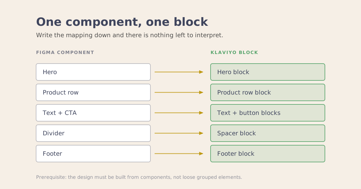
It works by mapping each Figma component to a specific Klaviyo block. Hero component to hero block, product row component to product row block. Once that correspondence is written down, there is nothing left for anything to interpret.
Whether it works for you comes down to one property of your design file, and almost no guide on this mentions it.
Why Most Attempts Fail
The prerequisite is that your emails have to be built from components, not from loose elements.
Open your Figma file and look at it honestly. If your designs are separate text boxes, rectangles and images grouped together to look like an email, no system can read them reliably. There is no structure to translate, so anything reading the file has to infer what each piece is meant to be. Inference is guessing, and guessing is fine until the day it guesses wrong on a send.
I learned this from the wrong end. My first AI-built emails came back with colors I never specified and layouts I never drew. The model was not the problem. Nothing in my setup described how a design becomes a template, so it improvised, and improvisation is the last thing you want in email production.
Componentizing a design library costs a designer a few days, once. It is the single biggest change you can make to this whole pipeline, and it is boring, which is why it gets skipped in favor of looking for a better tool.
The Mapping
What makes it work is a stated correspondence, not a cleverer prompt.
Every component in the library has one block it becomes in the Klaviyo editor. Written down, checked, unambiguous. When that mapping exists, output stops varying between emails, because there is no decision left to make.
Two things have to sit alongside it.
Design tokens live with the design system, not in a prompt. Colors, spacing, type scale. If the values only exist in someone’s instructions, they drift the moment anyone rewrites the instructions.
Each client gets a folder structure, and each folder carries its own context. Brand, Klaviyo, Figma, campaigns, reports, reference. Instructions on their own are not a system. The tokens, the reference docs and the rules have to live where the work happens, or they get forgotten precisely when they matter. That distinction, between using a tool and having something that runs, is the whole gap I wrote about earlier this year.
Where the Campaign Information Lives
The second half of this has nothing to do with design.
Every campaign is a task, and the task holds everything: the copy, the segment, the send time, the inclusions and exclusions, links to the products. One place, not five. When a campaign is an email thread plus a spreadsheet plus a Slack message, the build stage becomes an exercise in reassembly, and reassembly is where things get missed.
Before the copy exists, there is a brief. This is the stage most teams skip, and it is why their output feels subtly wrong without anyone being able to name the problem.
I watched a copywriter go from campaign idea straight to finished subject lines in a single conversation. Nothing was wrong with the prompt. What was missing was the step where the campaign gets decided: what this send actually is, who receives it, what the offer is, what it has to achieve. Brief feeds copy, copy feeds the task, the task feeds the build. Remove the first link and everything downstream is confidently built on an assumption.
One line worth adding to any brief prompt: ask me questions if you need any more information. A model fills gaps with its own guess by default, and it does not tell you it guessed. It asks when you tell it to.
What Running It Looks Like
The input is two links: the Figma frame and the task.
The shape of a production month matters more than it sounds. I design everything in Figma across about a week, all the campaigns, refined until I am sure. Then I sit down for one build session and work through them.
The first email takes around 10 minutes, because the design system, the tokens and the documentation all have to be read before anything is built. Every email after that takes a fraction of it, because that context is already loaded.
That single fact is the argument for batching, and the unit that matters is the session rather than the day. One email on Tuesday and another on Thursday, started fresh each time, pays that warm-up cost twice for 2 emails. Ten in one sitting pays it once.
Two rules that came out of getting it wrong:
One campaign at a time. Hand over 5 at once and quality degrades. Things get missed, and nothing flags the miss because the build still completes.
For flows, map before you build. I have the flow laid out as a chart first, something you can look at and argue with, before anything touches the API. Building is the cheap part now. Knowing exactly what you meant to build is still the actual work, and it is the part that never got automated.
What Comes Out, and What It Does Not Do
What lands in Klaviyo is a genuine drag-and-drop template built from live text blocks, with no JPEG slices and no single large image pretending to be an email. Editable text, real blocks, the same structure a careful person would build by hand.
It arrives complete in the parts that are easy to forget: alt text on every image, links in place, subject line and preview text already written from the brief. Those are the things that get skipped at 6pm on a send day, and they are exactly the things a system should be holding.
It is not finished. I still go in and adjust padding and spacing, and drop in the universal blocks and the product feeds where they belong. I have stopped expecting otherwise. What it is, reliably, is structurally complete with the error-prone busywork already done.
That distinction is worth being clear about, because the pitch you usually hear is full automation. This is not that. It is the removal of the mechanical half of the job so the remaining time goes into judgment: whether this campaign should exist, who it goes to, and what it needs to say.
Something Reads It Before Your Reader Does
There is another reason to care about live text, and it is not new, which is rather the point. Both major inboxes have been doing this for a while and most email programs still send as though they were not.
Apple Mail has summarized messages since iOS 18.1. The summary replaces your preview text in the inbox list, it is on by default, and nobody asked for it. Gmail has run its own version since May 2025, with Gemini summary cards on by default in the mobile apps, though those sit above the email once it is opened rather than in the list, and they are limited to paid tiers and to English.
That difference is worth holding on to. Apple’s version affects whether the email gets opened at all. Gmail’s affects what somebody takes away once they are already inside it.
Both are built from real, coded text. An image is not read. And the part that catches people out is that alt text is not read either. Apple’s summary generator ignores it.
So picture the sliced version of your email landing. The headline is inside the hero image. The offer is inside the hero image. The call to action is inside the hero image. None of it exists as far as the summary is concerned, so the line sitting under your subject line, the one now doing the job your preview text used to do, gets assembled from whatever scraps of real text survived. Often that is the footer.
To be fair about it, Gemini copes with an image-heavy email noticeably better than Apple Intelligence does. But Apple Mail is where the summary has already replaced the preview line, which makes it the one to design for.
This is a new kind of failure, neither a rendering fault nor a spam score. The email arrives looking perfect and describes itself badly, in the exact place where somebody decides whether to open it.
A template built from live text blocks never has this problem, because everything that matters is already text. Which turns what used to be a craft preference into an operational one.
Slicing Was Never the Bottleneck
An agency owner pushed back on me about this. Slicing an email into a template, he said, is the most basic task there is. Why complicate it.
He is right that slicing is easy. It was never what took the time.
The time goes into everything around it. Alt text, links, cloning the campaign, renaming it, assigning segments, setting inclusions and exclusions, scheduling the send. Then multiplying that by every email on the calendar, for every brand. That is the part worth building a system for, and it is invisible to anyone measuring the wrong step.
If you want a second opinion on whether your design library is ready for this, book a strategy session.